Geanna Revell, RDN:
Brand & Identity
After Geanna Revell got her license to become a Registered Dietitian Nutritionist (RDN), she wanted to start her own private practice. Having worked together successfully in the past, she approached me asking for my help in designing a logo, business cards, and a website.
With a strong focus on helping people heal their relationship with food and body image, as well as carving out intentional space for folks with diabetes, Geanna wanted her brand and identity to feel:
Compassionate
Trustworthy
Approchable
Professional
Caring
Classic
After going through the creative process, I was able to create deliverables for her that matched these values. We are both thrilled with the results!
Logo, Business Card, and Website Design
Sarah Cadwell
FINAL BRANDING AND DELIVERABLES


PROCESS: LOGO MOODBOARDS
I started with showing Geanna four moodboards, and after she asked me to combine the first two together, option five was the direction we moved forward with.


PROCESS: LOGO ROUGH SKETCHES
I spent time sketching concepts based off the moodboard, and these three options felt the strongest in matching her wants / needs. Each concept explanation I shared with Geanna can be read below. Ultimately, Geanna picked option 03. After some fine tuning, it was solidified as her final logo.

01 / Heart and Hand
“It shows that you're approachable, friendly, caring, trusting, and have their best selves in mind.”

02 / Apple & Cookie
“This is riffing off of the ‘All Foods Fit’ tagline. I love the idea of combining something on the ‘healthier’ side with something traditionally viewed as ‘not healthy.’”

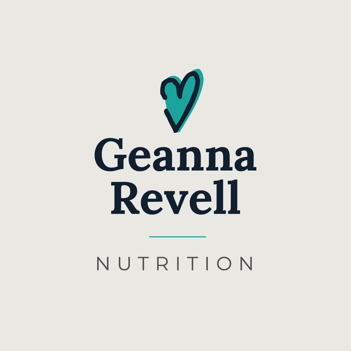
03 / Heart ‘V’
“…Cute to play off the heart in the ‘V’ in your last name. This would a type-based logo. Focus on the heart, compassion, and caring nature.”